This is where YOU come in.....I've narrowed it down to the three images below. Leave me a comment (click "comments" right below this post) with your vote of which I should enter. There's no special theme to the exhibition, so anything goes.
Thanks so much for your help on this...I'm so indecisive! :)
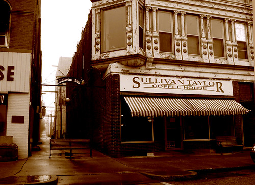
Image #1 - Sullivan Taylor

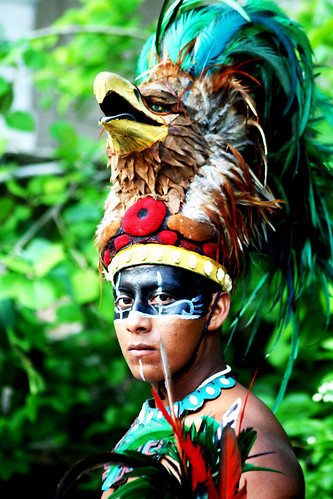
Image #2 - X Caret

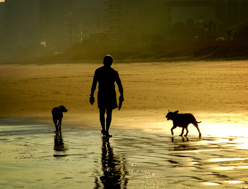
Image #3 - Mr. Myrtle


50 comments:
Dearest Bulldog,
I select number 2. Why? Because of the quality of the color, and the overall crispness. I'm viewing it on my cellphone, and it's still powerful. The composition is great as well...not too close, yet not too far away. My eye goes straight to the eagle (hawk?) and then moves nicely from there. The green is a fantastic tone as well! You've got talent there, BD, lots of it.
I really like the first one as well, but it pales when compared to the second. The third, to me, is a scene I feel I've seen before.
So yeah, number 2. I think it has best-in-show written all over it. Good luck!
Hands down - Image #1. Good to hear from you.
-cb
Oh my. This is a hard choice. I'd have to agree with nagle. Number three is great, but a bit cliche. Number 1 is nice, but in a place where there will be lots of photos, would be very easy to pass by and not really take notice of. Now, number 2 is my pick because the sharp colors and striking pose of this guy draw you in immediately.
Good luck.
Hey Chey, Cork & I think #2 is awesome! We agree with nagle's comments. we have to say we've never seen anything like that before - good luck & blessings!
ps - your pics are great, thanks for sharing
The historian in me loves the feel and authenticity of #1.
Dearest Daughter:
You have an amazing eye. I think your work is outstanding. If I have to choose, I'll go with #3 Mr. Myrtle. It looks like something you would see in a travel magazine. It's hard to admit, but you may be a better photographer that your dad. If not, your'e very talented to say the least. Love, Daddy-O
I LOVE Mr. Myrtle. You know me, I love the beach. But I love how the figures look so dark against the sunset. Gorgeous.
#2 for sure...that's something you don't see everyday and the colors (at least over the computer) look amazing. Have you printed them all out? It may help to have physical pieces to hang up and look at to make a decision as well. I'd go with #2 from what I see online - love it!!!!
If you win anything I'll only charge a small fee for my awesome critique and feedback...lol
Hey Girl- I choose #2. It is not something you see everyday and the colors look great :) Good Luck.
I vote number 3..I like the way the water looks especially in this image. This looks like a picture you would see in a magazine or a postcard.
~D Beranek
Hi Cheyenne,
WOW, these are all great but my favorite is #1. I just like the peaceful, calming feeling it gives me when I look at it. Good luck in your decision.
Trina ;)
Cheyenne,
Your photography is wonderful. For the entry, I choose #2. The colors are awesome.
I think you have a great future in photography. You certainly have the eye for it.
Good Luck. Judy
I like image #1 the best but the bright colors in image #2 will probably capture the most eyes if it's a photo gallery. So, I guess I would have to suggest #2 for the gallery but you should find somewhere else to display image #1. Your photography is unbelievable! God has given you an amazing talent! Take care! Karen, your friend from Clemson!!!
Cheyenne,
I am amazed. I love all three. The history buff in me picks #1.
Your other friends comments are right on about #2. The colors and everything about it draws you in.
And you know me, I love dogs.
Show #2....there won't be anything else like it!
You rock! Hugs, Debby
My vote is for #2 as well. The colors definitely make it stand out, but the crisp resolution, especially on the details of the hawk are amazing. There's something about the contrast of all of those colors that you just don't see in everyday photography :)
Best of luck!
-Steph
For sure #2, I think the framing of the shot, with the striking colors and look on his face is impressive.
Great pictures!
Erick
#2 - For all the reasons others have already pointed out. The vibrant colors and the fact the subject is looking out at the viewer really draws the viewer in. It will be a captivating image for the show.
#2 - For all the reasons everyone already said. The vibrant colors and the fact that the subject is looking out at the viewer really draws the viewer in. It will be a captivating piece for the show!
I LOVE #3! This might simply be b/c right now, I would like nothing more than to be doing exactly what the subject in the photo is doing!
Anyway, I love the contrasts, the lighting, the simplicity...
I like the others, too (how could I NOT love the first one...I spent so many hours there drinking coffee and reviewing law cases for Earl's class!!)
It's a really tough decision!
Loving the newer photos you've posted to your blog, too!
I vote for #1. They are all awesome but I love the look, feel and history. Good luck, hard decision!
Sara
Little Prarie Dog,
Though I appreciate the days in good 'ol Macomb, I think I need to choose #3 Mr. Myrtle. I like the contrast from the water to the sand.
Hope all is well.
Herman
Beautiful pictures! I am really drawn to #2! Good luck, hope life is treating you well!
-Ann Carman
Kristin & I like #2! It stands out among many. . .much like yourself!
~Sabrina
I vote for image #2. Great color and detail!! Good luck!
Number one is the one I would like to be at if I could jump into a photo. But I believe you should enter Number 2 as others have pointed out, the colors are outstanding and the subject leaves you thinking. Good luck and let us know how it goes. Keep up the great work!
#2 ~ it's a great photo!
I just have to pick #1. #2 is gorgeous, but I love the feel of #1. Plus, I loved that coffeeshop.
Good luck! Your pics are unbelievable. I wish I didn't already have a photographer for my wedding. :)
Oh talented one! Though I'm partial to number 1 due to sentiment, I'd have to say number 2! Good luck and please keep sharing your wonderful talent!
Hi Chey!
Again, I am reminded how VERY talented you are!! I polled all of the gay guys at work and we agreet hat number two really stands out with the color and the expression on your subjects face. The other two seem like what other photographers in the area may have captured. But #2 def stands out as a travel pic. I am SO very proud of you!
Love you tons! Jenn Grimes
I think you should send in picture 2 - it has the best emotional content!
Eli
Anonymously. I also like #2. Well done! I think it's awesome that you do this and you do it so well. See you around!
Jason
#2 is the most powerful. I want you to send me number one of course...but number two has vibrancy and richness and it is balanced with that intent look. Where was that taken?!
Megan
the colors in number 2 are amazing. i would go with that one. but, you couldn't go wrong with any of them!
Nagle said it all, #2 is the one.
Your work is amazing! It sounds (and looks) like your having a great time pursuing your dream. Keep the passion!!
Love ya (both)
George
The beach shot is the best, you need to crop the top left corner just a little to remove that section of sky that sticks out
Second choice is the guy he has great eyes
Well...you must know I'd choose #1. I think it's a very subtle, quiet photo which has the ability to speak volumes to the viewer's eye. Good Luck!
MJ
Cheyenne,
There are a lot of good opinions already on here, and they are all beautiful...I can see why it was so hard for you to choose.
I'd have to go with #2 though. It is just so captivating, the color is amazing and it keeps your eye moving...Love it! (I would've picked my flamingos though ;)
Love you buddy,
Jackie xoxo
Cheyenne, these are captivating...they each take me to another place, touch my emotion, make me want to know more. Thank you for sharing your gifts so wonderfully. If I have to choose, I would go with the color, this is most memorable if I were to think about these images six months from now. It reminds me of National Geographic. I have to say...I love them all........all of them on your web site. I am so blessed to have such creative twosome in my life! What a team!
Karen Schultz
They are all great, but Andy and I say #2.
Hi Cheyenne ~ It's Mary Sue from CA
I love them all...wish I knew more of the history behind #2. It is striking and dramatic!
Out here in CA anything goes so I vote for #2. Please tell me the story behind the photo some day?
Thank you ~ I wish you well in your photo showing.
Mary Sue Rice (Karen's Cousin)
I can see why you are having trouble choosing. I like either #1 or #2 best. The "Sullivan" photo has lots of interesting angles and depth. It held my attention the longest. The "Mr Myrtle" is amazing and unusual and I can see why that got lots of votes. Whether you win this one or not, you're work is amazing! Keep at it.
Image #3 - Mr. Myrtle
It speaks to me... Serene, intimate, beautiful, quiet, soothing, personal.
Judging from the other comments, I'm not making this any easier for you, am I... Hugs to you and Geoff!
Love,
Cousin Marla in CA
My opinion is that all are wonderful based on individual merit. However, I personally like #3, Mr. Myrtle the best. Maybe it's because of my love for the outdoors and for dogs but I can imagine myself in this setting alone with my thoughts while still being accompanied by my "best buds".
Good luck and let us all know how you fare.
Ed Lorenz
Cheyenne:
Go with #2. By far the most interesting of the three. Such a strong portrait that it could also be printed in black and white and still be evocative. Hope all is well. This is Mike Myslinski in California, and I am Karen's cousin. We met this summer at your reception in Chicago suburbs. In fact, that reminds me to send you some photos I took there. Good Polish family stuff. Take care....
I think that I know nothing about art, but I agree with what everyone has said about image #2..the colours, the look, no one else will have a picture like that! Good luck! Your pictures are fantastic!!
I like the 1st one.
I select #2 I'm not sure why it just grabs the attention of the viewer maybe it's the color or his eyes just kinda make you wonder what he's thinking
Joyce B.
My choise is #2.
They are all so different-- but I think that I pick #2 just because it immediately draws your eye in what will probably be a world of sepia and black and white.
Good luck!
I couldn't figure out how to get to the comment part so if you want to pass on my vote, it's #2. Although it was very difficult. At first it was the coffee store front but I think that was because I saw it first. All good choices; I pick #2.
Janice Story
Post a Comment